June 11, 2014
"I Hate Stacked Area Charts"
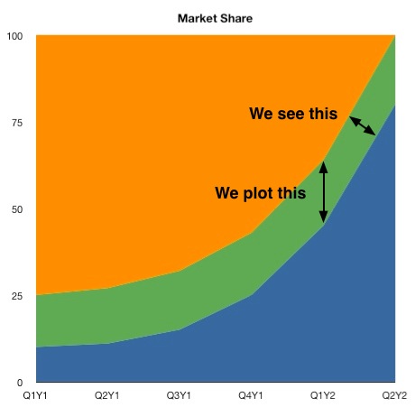
This example illustrates why it’s important to think carefully about how data visualizations will be perceived by readers. Good writers do this automatically, but it seems more difficult with graphs.
Based on this, I consider stacked area graphs in the same category as pie charts: to be used only with great care.
Comments? Please send me a message.