November 15, 2011
Mapping U.S. Obesity Rates at the County Level
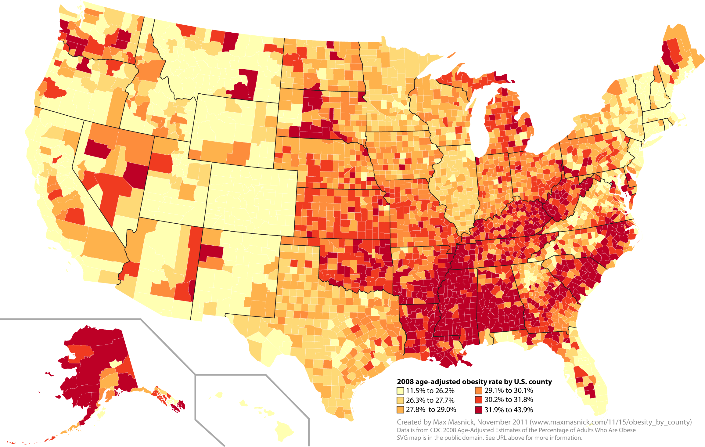
Age-adjusted obesity rates by U.S. county (2008). Click to enlarge, or view the large PNG or SVG. Higher obesity rates are darker.
I thought it would be interesting to see how obesity rates were distributed geographically in the U.S., so I did some searching. The CDC has a great time-lapse map of state obesity rates, but I was curious how this would look at the county level. For example, there are huge differences between the western and eastern parts of Montana (my home state), or between the areas around big cities and the rural counties in North Carolina (my current state).
There is county-level data available, but it’s separated by state. I wanted to see the entire country at once, so I made my own map (see above).
Probably the most striking thing about this map is that it looks like the South is in trouble. Obesity-related chronic disease is costly to treat, affects worker productivity, and generally reduces quality of life. Not surprisingly, the states with the highest obesity rates have the worst overall health according to at least one ranking. I’m curious how this relates to health insurance expenditures – I’m looking at what data are available on this for a follow-up post.
There are also some striking differences within states. Look at North Carolina, for example:
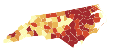
That’s a pretty striking difference between the eastern and western halves of the state. Visually, it looks like this difference might be correlated with population.
Speaking of correlations, I wanted to see how obesity rates correlated with socioeconomic status. Using median household income in each county as an estimate of this, I made this map:
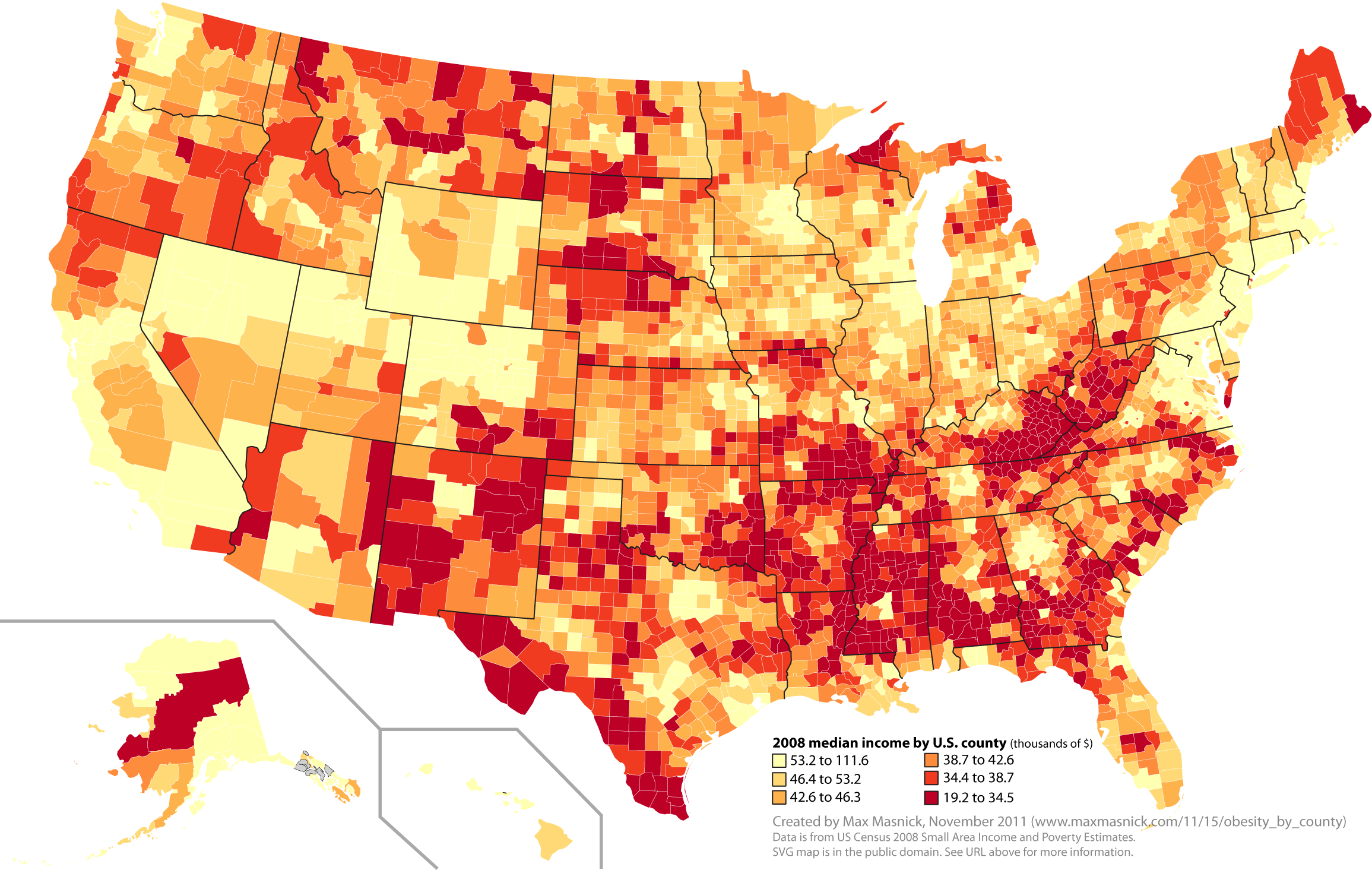
Median income by U.S. county (2008). Click to enlarge, or view the large PNG or SVG. Lower income is darker.
Here are the two maps next to each other (obesity on the left, income on the right):
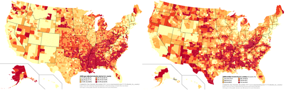
Visually, there are some macro-level similarities between these maps, especially low-income high-obesity regions in the South, and high-income low-obesity regions in the Northeast and the West. However, the association between socioeconomic status and obesity appears to be weakening.
Finally, take a close look at the key of the obesity rate map:
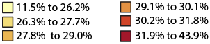
This means that about 5/6ths (83%) of U.S. counties have obesity rates over 25%.
Source materials and methods
- Map coloring. I used code from an excellent tutorial at FlowingData. Both maps were colored by splitting the counties into sextiles (six roughly equally-sized groups by obesity rate or median income), giving the best variability in color across the map.
- 2008 county-level obesity rates. From the CDC Diabetes Data & Trends website. But the data download interface on this website is awful. There was no way to download all the U.S. data at once – each state had to be downloaded individually. It was also impossible to scrape the site to automatically download the data, so I had to click “download” 50 times. Except that because of a bug in the interface, it didn’t work the first time, so I had to click “download” 50 more times.
This download interface is so bad that I’m making a combined CSV dataset of county-level obesity data for all 50 states available here so no one has to repeat this pain. Please verify the correctness of these data before you use them for anything important. - 2008 county-level median income. From the US Census. Much more accessible than the CDC data.
- Source map. I used this excellent pubic domain SVG map from Wikipedia.
- Color scheme. I used http://colorbrewer2.org/ to generate the color scheme for the maps.
Comments? Please send me a message.